Vizual Intelligence specializes in creating beautiful and dynamic dashboards that are fully functional. Our dashboards are sure to impress any audience.
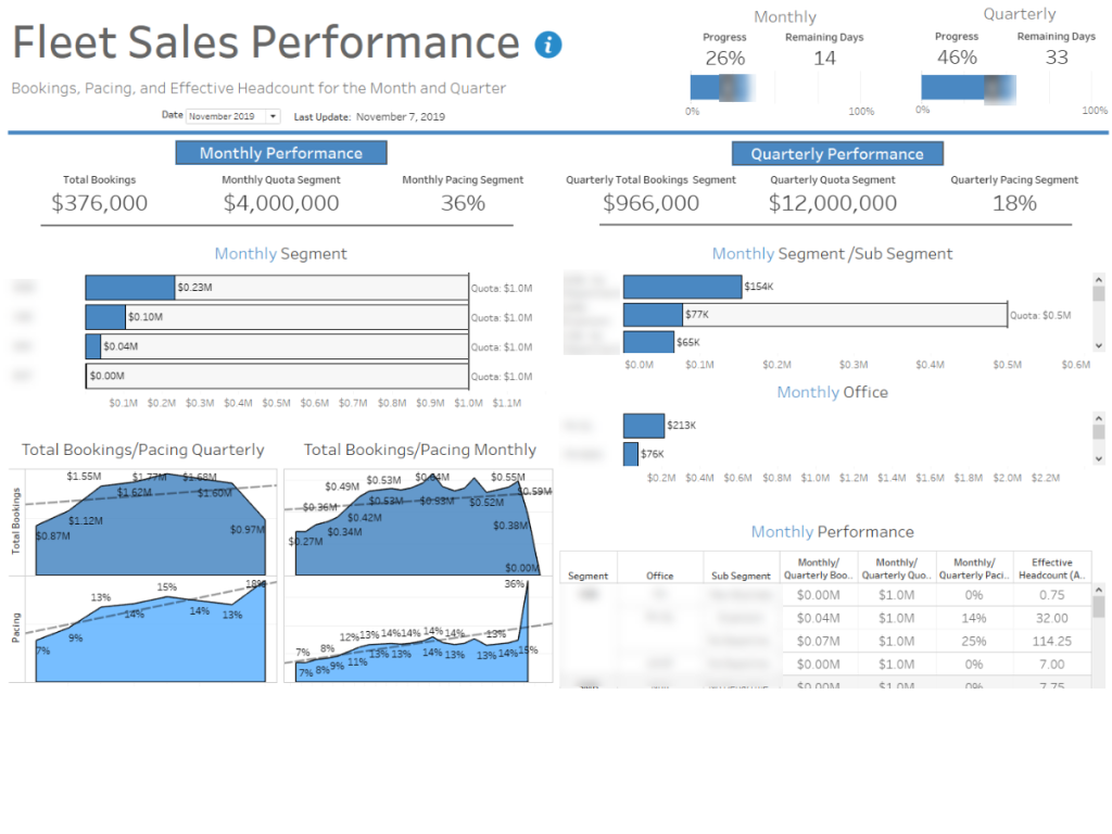
Sales Performance
This is an example the client wanted to look at monthly and quarterly sales performance split out by different segments. At the top we can see how they are tracking as of today looking at it monthly or quarterly. Below that we can see how each segment/sub segment is tracking compared to the quota and trending below that.
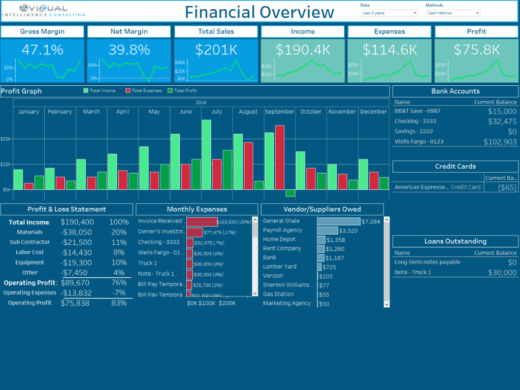
Financial Executive Summary
This dashboard was looking at accounting data. We wouldn’t a high level overview of the companies health. We can see at the top important KPI’s and how they trend. Then below that we have a chart looking at profit over time with some addition details below it.
Client Reporting Executive Summary
This dashboard is looking at NFC taps for a client. We have an overview of the KPI’s on the top and different splits of those KPI’s below.
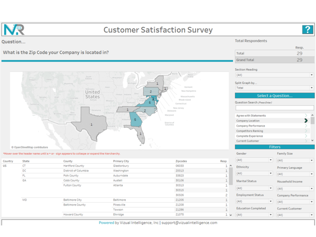
Customer Satisfaction Survey Dashboard
This is an example of how we can convert survey data into an interactive dashboard. In this dashboard, you can filter and segment your survey data by any of the filters. As you select different questions the chart type will change.
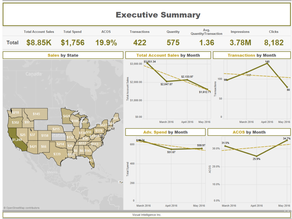
Transaction Executive Summary
This dashboard was created to look at Amazon transaction data. It will be updated with the client’s data on a monthly basis so the CEO could provide his clients with an interactive dashboard of their progress.
Biometrics Survey Dashboard
This dashboard is looking at biometric survey results. A parameter is used to flip through all the different questions. Each chart will update with the answers from each survey question. It also has a large filter panel so you can filter the data how you want.
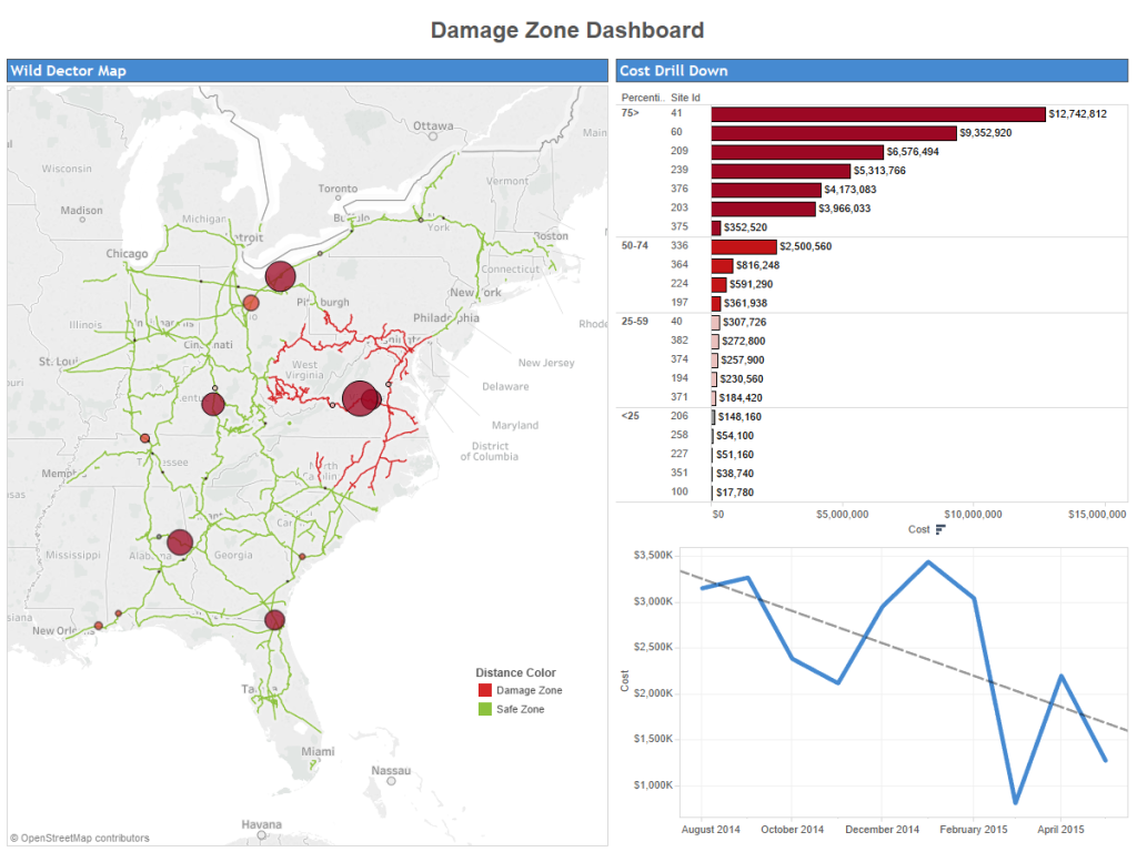
Railroad Damage Zone Dashboard
This dashboard was created by using a custom shapefile that allowed me to map railroad tracks. I then overlayed where railroad track sensors and the cost of each sensor site.
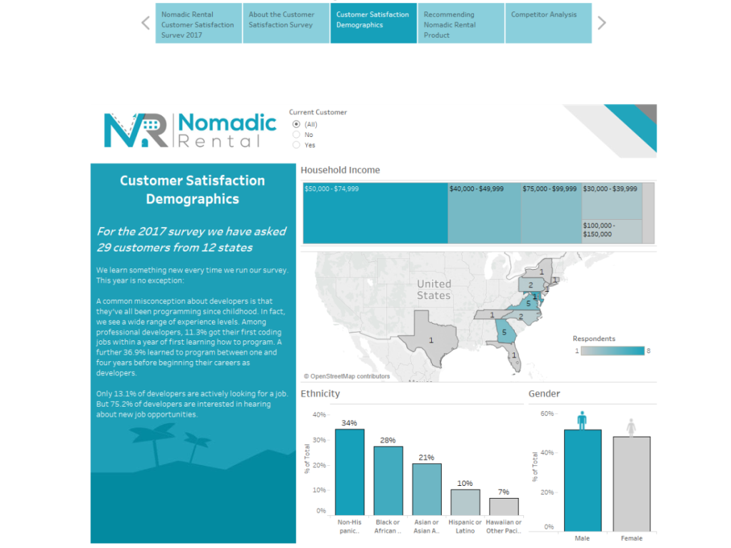
Customer Satisfaction Survey Presentation
This is a demo presentation for survey data. We created a Tableau story that would allow the end user to present the data and also answer questions on the fly.
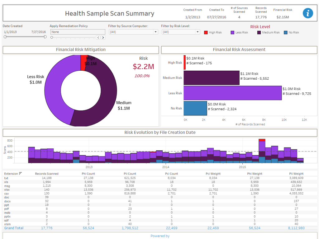
Computer Health Scan Summary
This dashboard was looking at scan data from computers in a company. The goal was to see how much risk a company had if sometimes got access to their computers. The company would then go on and tell them how they could mitigate that risk.
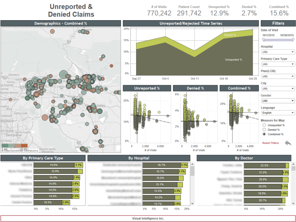
Healthcare Unreported & Denied Claims
This dashboard was looking at healthcare medical claims data. You can see by each provider what there unreported or denied percentage was. You can click on any mark in the viz to filter the other.
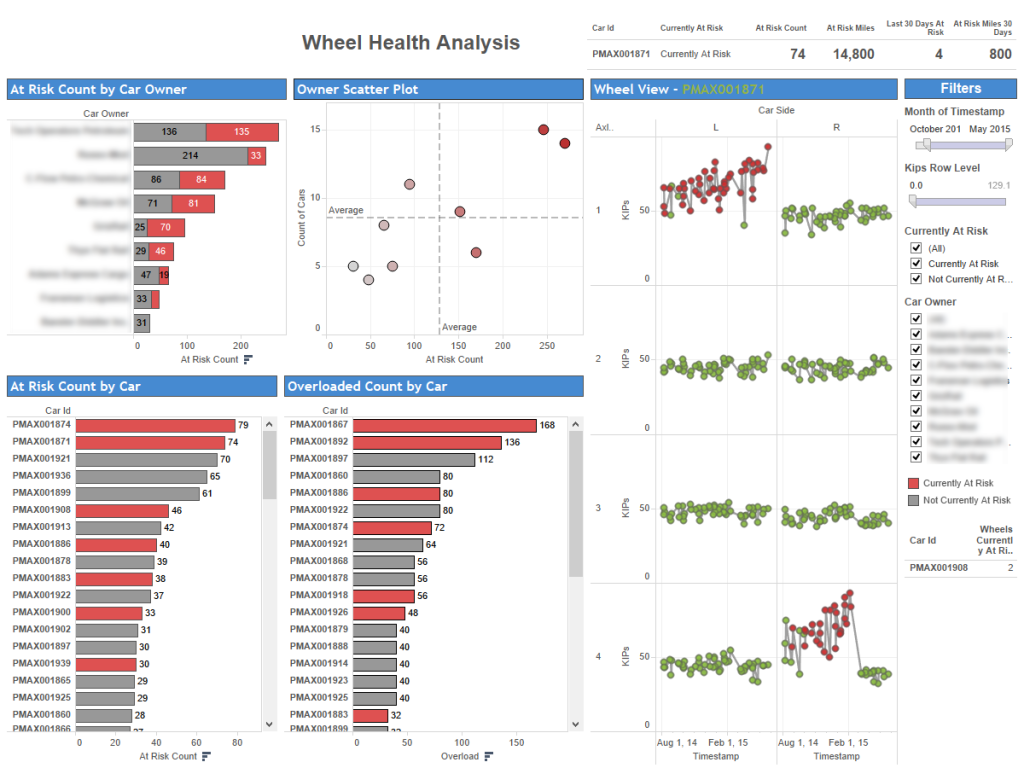
Locomotive Wheel Analysis
This dashboard is looking at a locomotive wheel sensor data. The chart on the right is looking at each wheel and reporting what the sensor deems at risk so they can fix it before it breaks.
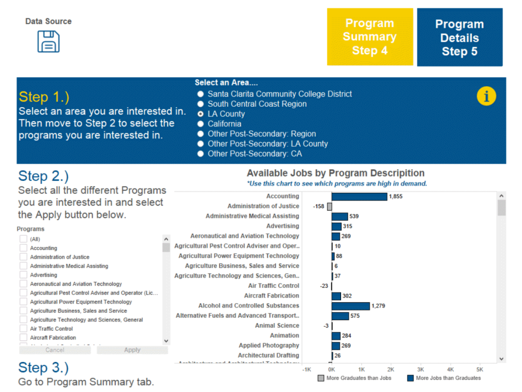
College Labor Market Tool
This dashboard is embedded on a college website so that students can look at different programs labor market data. This dashboard is more of a tool that the students can walk through to look at the data.
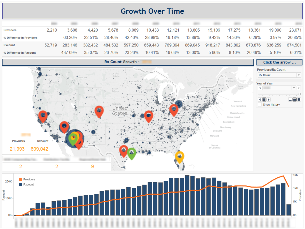
Provider Growth Dashboard
This dashboard plots where a Pharmacy office is located and all of there providers. You can hit the play button to see how their provider population grew over time.
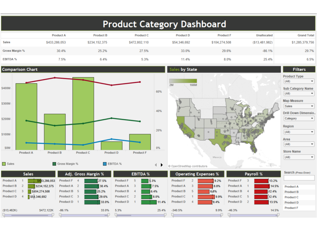
Product Category Finance Dashboard
The Product Summary Finance Dashboard is looking at financial data for different categories of the business. You can see the financial data for all categories of the business as well as drill down into it.
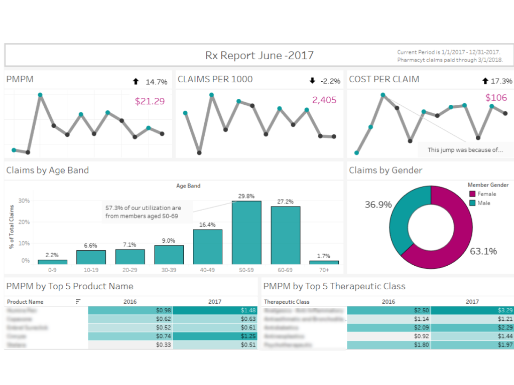
Healthcare Rx Report
This dashboard is a report style dashboard that was made to print nicely. It is an overview dashboard looking at Rx Claim data over time and by demographics.
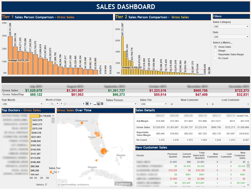
Sales Dashboard
The Sales Dashboard is an overview of how the sales team is doing. At the top, you can click on a salesperson name to see there sales data.
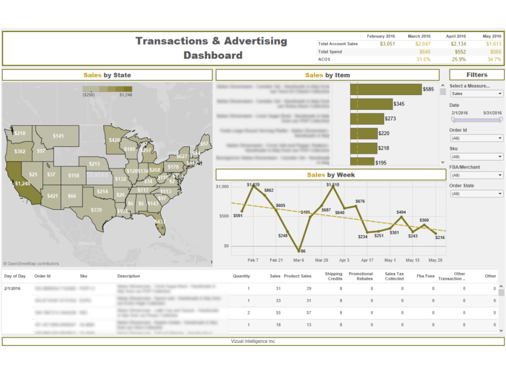
Transaction & Advertising Dashboard
This dashboard is looking at Amazon transaction data. You have a parameter on the right that allows you to switch which measure you are looking at. This report was given to clients so they can review their data.
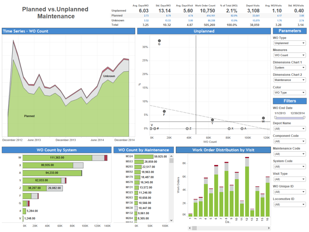
Planned vs. Unplanned Maintenance
Here we are looking at locomotive maintenance data again. It is an overview dashboard where you can cut and slice the data in a lot of different ways to answer any question.