Tableau Dashboard Tips – Top 10
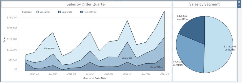
So you have all your charts built out now it’s time to put it all together. To me, this is the most important step because this is what your end user is going to see. Your analytics could be badass but if it looks like crap no one is going to want to use it. You have to make sure your Tableau dashboard is user-friendly and visually appealing. Here are the Tableau dashboard tips I use for every dashboard I create.
FREE DOWNLOAD: Don't leave empty handed, download the Top 10 Dashboard Tips PDF to take with you. Get all 10 tips in a 1 page PDF!
Use Layout Containers
Using Layout containers may not seem necessary but they will keep your dashboard more organized. This helps tremendously when you need to readjust your dashboard at a later time or add/delete worksheets. You use a vertical container when you need to stack objects on top of each other and you use a horizontal container when you need to put objects next to each other. Trust me I know getting the containers to do what you want can be a pain but it’s worth it!
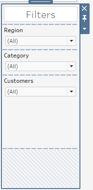
Filters and Parameters in Panel
A perfect example of using layout containers is putting Filters and Parameters in a container. If you use any Tableau dashboard tip, this one is a must! I always create a Filters panel that is a Vertical container with all my quick filters and parameters stacked on top of each other. I then add a Textbox on top with the text “Filters” just so people know exactly what it is. If you don’t use containers for anything else please use them for your filters and parameters, your users will really appreciate it.
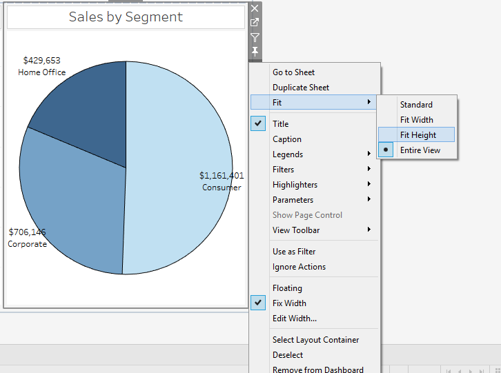
Fit to Width, Fit Height or Fit Entire View
After placing your worksheets in a container you will sometimes need to adjust the fit. You have three choices, fit width, fit height and fit entire view. You will use fit height if you have a vertical scrollbar that you want to get rid of, you will use fit width when you want to get rid of your horizontal scrollbar and you will use fit entire view when you want to get rid of both scroll bars. Now if you don’t have scrollbars that means your worksheet is smaller than the container and once you fit it, it will stretch to fit the container.
Add Information Icon
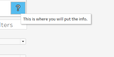
Information tooltips are easy to create and very helpful for the end user. We will be placing a little icon on the header of your dashboard title with some helpful information for your end user. When a user hovers over this icon they will see the text you provided. This gives you the ability to explain some elements of your dashboard that are complicated or provide some notes. If you are interested I have an entire blog explaining how to do this: Creating an Information Icon in Tableau.
Add Header Summary
Summary headers are very helpful and don’t take up much room. Usually, everyone wants some sort of summary or quick overview so I usually create a summary worksheet and float it on the title header. The header usually has empty spaces on the sides so why not use that space to add some extra value to your dashboard.

Add Logo
It is always good to brand your dashboard, it just gives it that final finished look. You can insert the logo and float it in the title header so it does not take up to much space. It is also a good idea to format your dashboard to match the company’s colors.

Format and Resize Dashboard
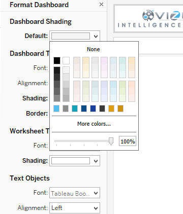
I am a big fan of formatting, I think it gives your dashboard a more polished look. I usually change the background color of the dashboard and worksheet titles, add a border to the titles, and maybe change the color/font of the text. The colors you choose should be dependent on the company’s color scheme.
Format Tooltips
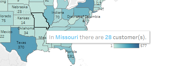
Formatting tooltips is another tip that can make your dashboard more user-friendly and give it some wow points. You can format the tooltip in many ways and add extra fields that are not in the visualization. Think of the tooltip as a supporting analysis for your Viz. Also try the viz in tooltip feature which you can make some really cool things with, here is a blog all about it.
Filter Actions
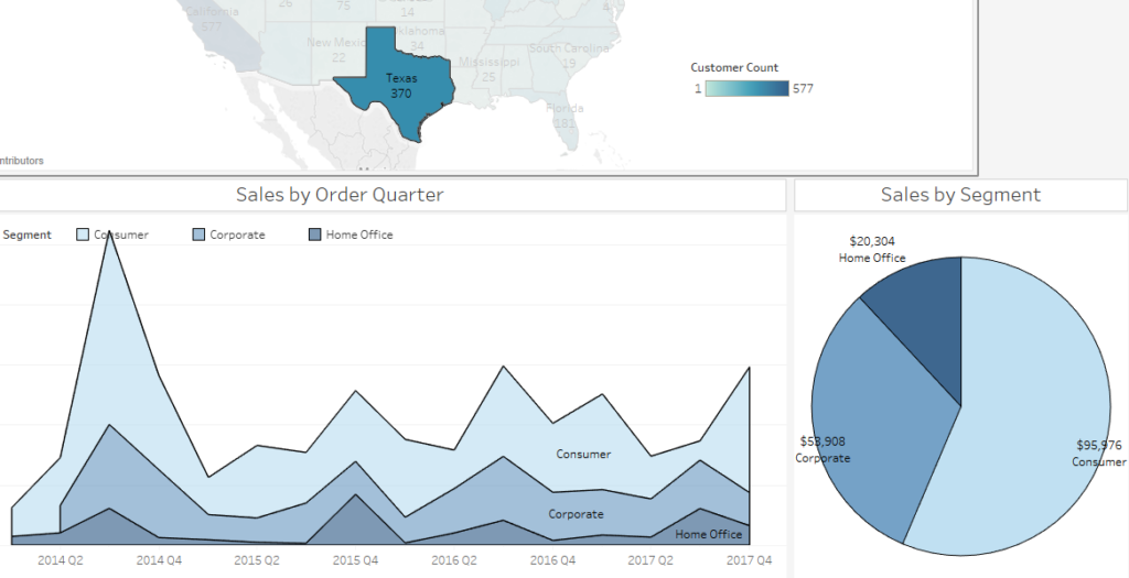
Actions are very powerful and a must on almost every dashboard. This is to me the best feature in Tableau, it gives you the ability to make a Viz into a filter and add interactivity. It’s really simple to set up so there shouldn’t be any reason why your dashboard does not have any filter actions. This Tableau dashboard tip is needed to really increase your interactivity with your dashboard or else it’s just a regular report. It also helps with performance which is why I wrote the Use Filter Actions over Quick Filters blog.
Float Legends
Legends are sometimes needed on your dashboard but takes up valuable space. I usually find some empty space next to the corresponding worksheet and float the legend in the empty space next to it. If you select the menu carrot on the legend you can arrange the legend into a single row or single column if needed.

Those are my Tableau Dashboard Tips
So these are all my Top 10 Tableau dashboard tips. Please do not make some plain all white dashboards with no formatting, just following these Tableau design tips to give you a head start. Also, take my free guide with you so you can always reference it later.
FREE DOWNLOAD: Don't leave empty handed, download the Top 10 Dashboard Tips PDF to take with you. Get all 10 tips in a 1 page PDF!


